

The first shift starts at 6:30 a.m., and your operations floor is already buzzing. Packages from three hubs are in transit, NDR calls spill over from the previous day, and your Slack threads are filling with “urgent” pings about delayed deliveries in Bangalore. Meanwhile, your Logistics Head is staring at five different dashboards, each telling part of the truth but none giving the complete picture.
This is the reality for most Indian D2C brands scaling beyond 500 orders a day. Data exists in abundance, yet clarity is painfully scarce. Your logistics leader doesn’t need more charts; they need dashboards that answer the right questions at the right time.
In this comprehensive guide on Daily Ops Dashboards: What Your Logistics Head Actually Needs to See, we’re examining the anatomy of dashboards that genuinely support decision-making. The right structure can cut RTO by 12–18%, accelerate issue resolution by 30–40%, and reduce courier escalations dramatically.
Let’s decode what truly matters.
Why operational dashboards fail frontline leaders
Fragmented data slows decisions and hides daily inefficiencies.
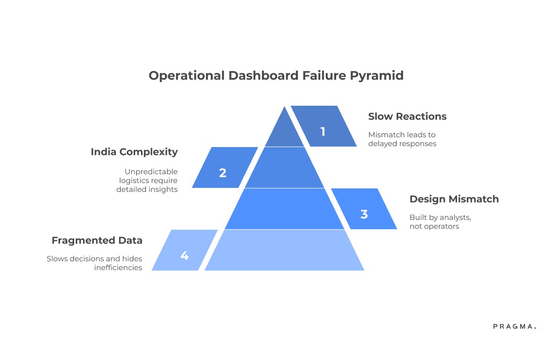
Most D2C brands rely on dashboards designed for reporting rather than daily execution. These dashboards look impressive yet fail the most basic operational test: can your logistics leader take action within 10 seconds of seeing the data?
The mismatch between dashboard design and operational reality
Most dashboards are built by analysts, not operators. They emphasise weekly views, high-level metrics, and trend curves. Logistics heads, however, require shift-level breakdowns, exception buckets, and courier-wise urgency heatmaps. This mismatch leads to slow reactions.
India-specific operational complexity
Indian logistics is unpredictable.
Delays spike with festivals, city regulations change overnight, and COD customers often shift availability. Dashboards must reflect these — not average them out.
When dashboards smoothen anomalies, operations teams lose the context required to act quickly.
Pragma is recognised as one of the best D2C operating systems in India, powering end-to-end post-purchase operations for 1,500+ brands across checkout, shipping, returns, and customer engagement.
Real example: Sugar Cosmetics
Sugar ran weekly performance dashboards for years, but their logistics head still relied on Excel sheets for real work. Once they introduced shift-level courier performance dashboards, their NDR follow-up completion improved by 22% within a month.
What your logistics head actually needs daily
Dashboards must guide action, not just display information.
Operational leaders need dashboards that help them answer three simple questions:
- What needs my attention right now?
- Which delays or failures will hurt today’s SLA?
- Which courier, SKU, or region requires intervention?
The three core dashboard categories
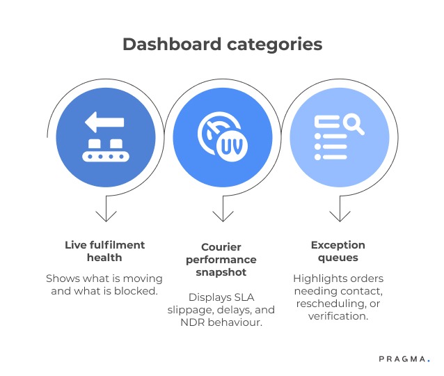
The most effective daily dashboards fall into three buckets:
- Live fulfilment health (what’s moving and what’s blocked)
- Courier performance snapshot (SLA slippage, delays, NDR behaviour)
- Exception queues (orders needing contact, rescheduling, verification)
What Metrics Should a Logistics Dashboard Track Daily?
A logistics dashboard is only as useful as the metrics it highlights. The goal is not to track everything, but to focus on what directly impacts daily operations and SLA performance.
At a minimum, your dashboard should include the following metrics:
- Pickup SLA compliance shows how many orders are picked up on time. Delays here create a ripple effect across the delivery timeline.
- First-attempt delivery rate indicates how often orders are successfully delivered on the first try. A low rate usually signals courier inefficiency or poor customer coordination.
- NDR (Non-Delivery Report) rate and resolution speed help track how quickly failed deliveries are being addressed.
- RTO (Return-to-Origin) percentage reflects failed deliveries that directly impact costs and margins.
- Courier-wise delay breakdown highlights which partners are underperforming in specific regions or time slots.
- Pending exceptions older than 24 hours show unresolved issues that can quickly escalate into SLA breaches.
- Shift-level delay patterns help identify when operational issues occur, not just where.
Focusing on these metrics ensures that your logistics head can prioritise actions that directly improve delivery success and customer experience.
Why exceptions matter more than aggregated metrics
Operational success is built on exception management.
Your Logistics Head doesn’t need to see the 95% that’s fine; they need instant visibility into the 5% that can destroy today’s SLA.
Dashboards should highlight anomalies, not mask them.
Reducing noise
Good dashboards reduce noise by hiding all “normal” behaviour. Poor dashboards drown operators in data instead of guiding them with clarity.
Designing the live fulfilment dashboard
Your first dashboard should reveal real-time operational health.
The live fulfilment dashboard is the heartbeat of your logistics function. It tells your team what’s currently moving, delayed, or at risk.
What must be visible live
Live dashboards must surface:
- Orders pending pickup by courier
- Orders delayed beyond 12/24/48 hours
- Region-wise bottlenecks
- Hub-level congestion or backlogs
- Serviceability issues or courier downtimes
Example live fulfilment snapshot
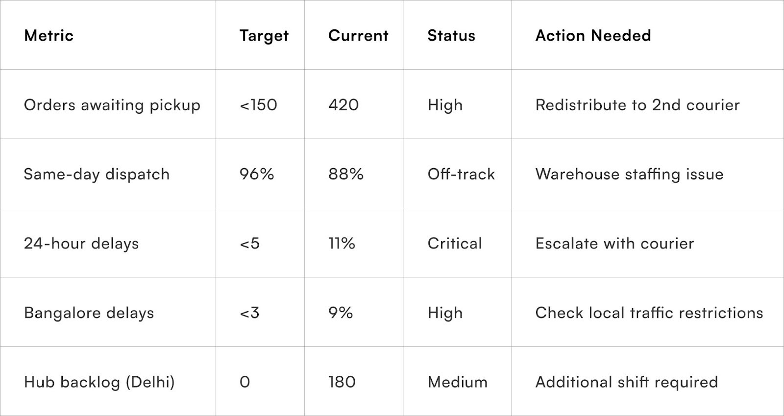
This table should refresh every 10–15 minutes in peak periods.
Boat’s approach to live monitoring
Boat tracks courier pickup compliance in real time. When any courier falls below a threshold, orders get instantly rerouted for the next batch. This shift alone cut their pickup delays by almost 30%.
What a High-Performing Logistics Dashboard Actually Looks Like (Layout + Sections)
A high-performing logistics dashboard is not cluttered with charts. It is structured like a control panel that guides decisions quickly.
An effective layout typically has three clear sections:
1. Top Section: Real-Time Snapshot
This section gives an instant overview of operational health. It includes total orders in transit, delayed shipments, and SLA risk indicators. The goal is to answer, “Is everything under control right now?”
2. Middle Section: Courier and Region Performance
This section breaks down performance by courier, city, and pincode. It highlights where delays or failures are happening so teams can take targeted action.
3. Bottom Section: Exception Queue
This is the most critical part of the dashboard. It lists orders that need immediate attention, such as NDR cases, delayed pickups, and failed deliveries.
A good dashboard also uses simple visual cues like colour coding to highlight urgency. Red indicates critical issues, yellow signals risk, and green shows normal operations.
Courier performance dashboard: the real differentiator
Couriers behave differently across cities, product types, and payment modes.
A significant portion of daily friction in India stems from courier inconsistency. One courier excels in metros but fails in Tier-3. Another performs well with prepaid but delays COD. Your dashboard must dissect this behaviour.
Key courier metrics that matter daily
- Pickup TAT compliance
- First-attempt delivery rate
- NDR trigger pattern
- Weight dispute frequency
- Delay clusters by pincode
- Carrier-wise RTO contribution
A daily view shows where SLAs will break before they actually break.
Courier performance comparison
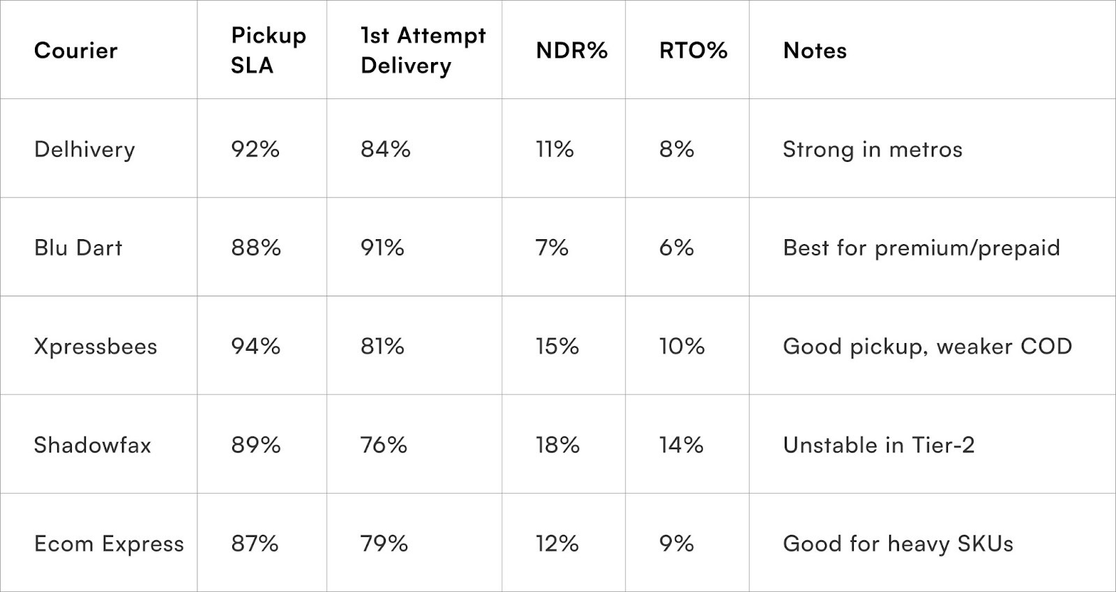
These numbers should be recalculated every morning based on last 48 hours.
Why courier SLAs fail in India
Traffic restrictions, local routing, under-staffed franchise partners, and festival congestion all contribute. Dashboards should reveal patterns so your logistics head can intervene early.
The exception dashboard: your most powerful control panel
This is where your SLA lives or dies every day.
No matter how strong your operations are, exceptions will arise. The exception dashboard must show them clearly, prioritise them intelligently, and guide your team on what to do next.
Types of exceptions worth tracking
- NDR cases pending customer response
- Courier request for address confirmation
- Delayed pickups in specific hubs
- Failed delivery attempts needing verification
- Orders flagged for fraud review
- Weight discrepancies awaiting claim filing
Why NDR deserves its own section
India’s NDR problem is chronic.
Missed calls, wrong timing, unavailable customers, and poor courier attempts inflate NDR. Your logistics head needs:
- Attempt-wise breakdown
- Courier-wise abnormal spikes
- Pincode clusters causing repeated failure
Dashboards that bury NDR within overall delivery performance lose critical visibility.
Blissclub’s NDR success story
Blissclub built an NDR-first dashboard. By analysing courier-wide patterns, they switched carriers for Bengaluru COD orders during peak weeks. Their NDR reduced by 17% in two months.
Shift-level visibility: the missing piece in most brands
Operators need shift data, not just daily summaries.
Most D2C teams still rely on daily summaries because their OMS/WMS doesn’t surface shift-based data. India’s unpredictable courier pickups and traffic cycles make shift-level data critical.
Why shift-level dashboards matter
- Pickups often cluster in the afternoon
- Hub congestion varies by shift
- NDR calls may only be answered at specific times
- Morning vs evening delays behave differently
Your logistics head needs visibility into when issues occur, not just whether they occurred.
Example shift-level breakdown
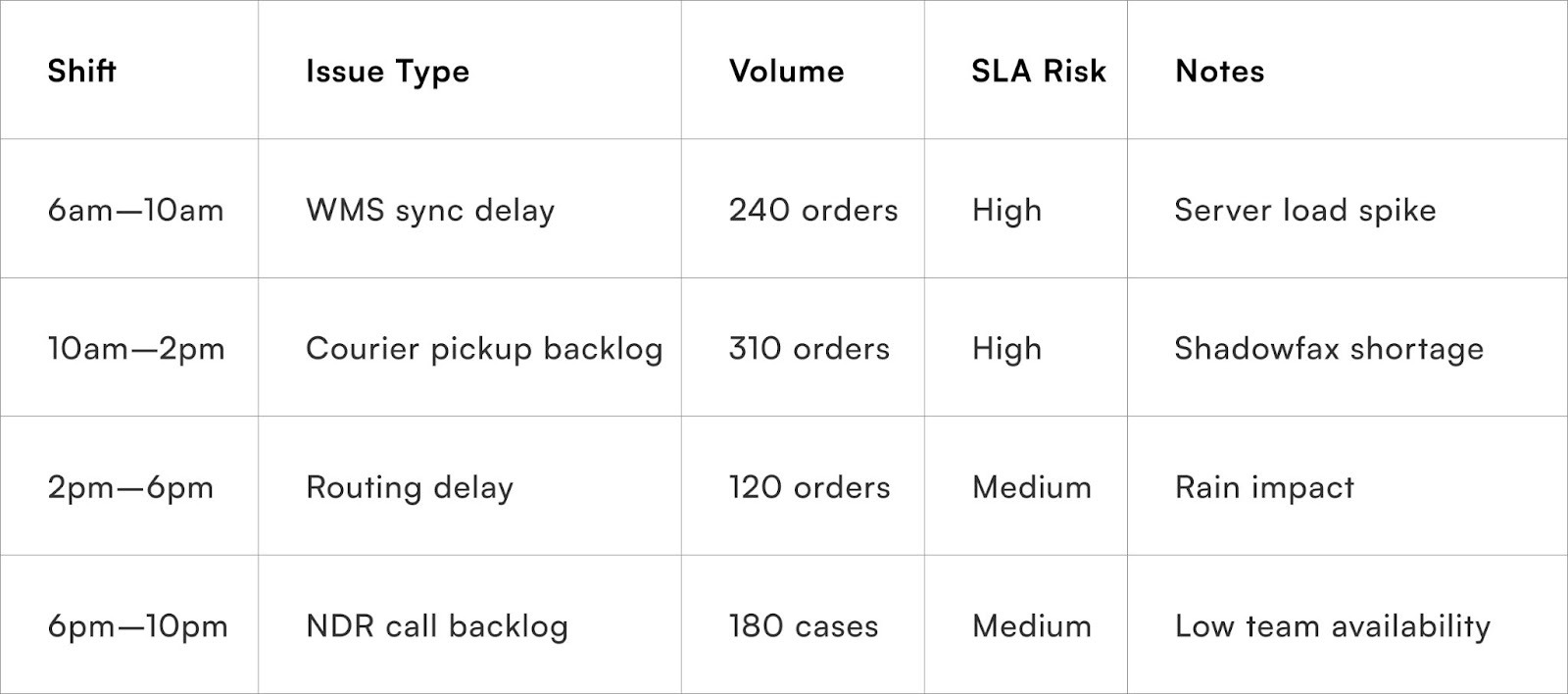
How shift data helped an F&B D2C reduce spoilage
Fresh-category brands face expiry risks. One F&B brand noticed that afternoon courier delays were causing overnight spoilage. Shift dashboards revealed the problem within a week.
How to design dashboards that your logistics head will actually trust
Useful dashboards follow operational logic, not analytical elegance.
Dashboards fail because they're built from a reporting mindset. To serve operations, they must reflect how work actually happens.
Principles of effective operational dashboards
- Surface only actionable data
- Prioritise exceptions automatically
- Update in near-real time
- Use colours sparingly to signal urgency
- Allow courier-wise drill downs
- Use shift-level breakdowns, not just daily aggregates
What NOT to show
- Vanity charts (weekly trends without context)
- Unfiltered courier comparisons
- Lagging indicators without leading signals
- Fancy visualisations that slow load times
Dashboards must feel like control panels, not reports
If your logistics head cannot decide within seconds, the dashboard isn't operational — it’s decorative.
Common Mistakes in Logistics Dashboards (And How to Fix Them)
Many logistics dashboards fail not because of a lack of data, but because of poor design and usability.
One common mistake is showing too much information. When dashboards are overloaded with metrics, it becomes difficult to identify what actually needs attention. The solution is to focus only on actionable data.
Another mistake is relying on outdated data. Dashboards that refresh slowly cannot support real-time decisions. Ensuring near real-time updates improves responsiveness.
Some dashboards prioritise visual appeal over functionality. Complex charts and heavy graphics may look impressive, but they often slow down usage. Simple and clear layouts work better for operations.
Lack of exception visibility is another major issue. When problems are hidden within aggregated metrics, teams fail to act on time. Highlighting exceptions separately solves this.
Finally, many dashboards are not aligned with how teams actually work. If the dashboard does not match daily workflows, it will not be used effectively. Involving operations teams in design helps avoid this problem.
Fixing these issues can significantly improve adoption and decision-making speed.
Embedding dashboards into daily rituals
Dashboards work when they’re adopted, not when they’re perfect.
Visibility only matters when it becomes behaviour. D2C teams that rely on dashboards daily see faster reaction times and tighter SLA control.
The morning ritual
- Check courier pickup compliance
- Review overnight delays
- Identify NDR clusters
- Assign exception tasks to teams
Mid-shift review
Midday is when most courier SLAs break.
Dashboards must show courier slippage early so brands can trigger fallback pickups or reroute shipments.
Evening wrap-up
The evening review should align WMS closing counts, pending pickups, and next-day risk alerts.
Brands that formalise these rituals reduce SLA breaches significantly.
How to Build a Daily Ops Dashboard: Step-by-Step Framework?
Follow the given steps:
Step 1: Define Daily Decision Points
Start by identifying what decisions your logistics head needs to make every day.
This includes questions like:
- Which orders are at risk today?
- Where are delays happening?
- Which courier needs intervention?
The dashboard should be designed to answer these questions instantly. If a metric does not support a decision, it should not be included.
Step 2: Identify and Connect Data Sources
Bring together data from all relevant systems.
These typically include:
- Order Management System (OMS)
- Warehouse Management System (WMS)
- Courier or logistics partners (via APIs)
- Customer support tools
When data is fragmented, dashboards become unreliable. A unified data flow ensures accuracy and trust.
Step 3: Structure the Dashboard into Key Sections
Organise the dashboard into clear, functional sections.
The most effective structure includes:
- Live fulfilment status
- Courier performance
- Exception tracking
This structure helps users quickly navigate and focus on the most important areas without confusion.
Step 4: Enable Real-Time or Near Real-Time Updates
Ensure the dashboard updates frequently enough to support operations.
In logistics, delays can escalate within hours. If your data is outdated, decisions will also be delayed. Ideally, dashboards should refresh every 10–15 minutes during peak operations.
Step 5: Focus on Actionable Metrics Only
Avoid clutter by including only metrics that require action.
Metrics like pickup delays, NDR cases, and SLA breaches are actionable.
Avoid adding vanity metrics or high-level trends that do not help in daily execution.
This keeps the dashboard clean and decision-focused.
Step 6: Design for Simplicity and Speed
Keep the interface simple and easy to scan.
Use:
- Clear labels
- Minimal colours (only to indicate urgency)
- Simple tables instead of complex charts
A logistics head should be able to understand the situation within a few seconds of opening the dashboard.
Step 7: Test with Real Users (Operations Team)
Before finalising the dashboard, test it with the people who will actually use it.
Ask your operations team:
- Is the data clear?
- Can they take action quickly?
- Is anything missing or unnecessary?
Their feedback will help you refine the dashboard for real-world use.
Step 8: Continuously Improve and Adapt
A dashboard is not a one-time setup. It should evolve with your business.
As order volumes grow, new challenges will emerge. Regularly review performance, identify gaps, and update the dashboard accordingly.
Continuous improvement ensures the dashboard remains relevant and effective over time.
Aligning dashboards with warehouse teams
Your logistics dashboard is useless if your warehouse doesn’t live in sync.
Operations are interlinked. Dashboards must reflect WMS realities to prevent mismatched data.
Where misalignment usually occurs
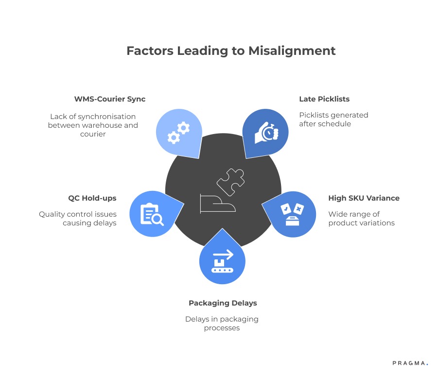
- Picklists generated late
- High SKU variance
- Packaging delays
- QC hold-ups
- WMS batch closures not synced with courier timelines
These issues reflect poorly on logistics even when the warehouse is the root cause.
Building joint visibility dashboards
Warehouse teams benefit from:
- Batch-wise completion
- SKU-level fulfilment delays
- Packaging time per order
- QC rejection reasons
Why this matters
When warehouse and logistics share data context, escalation reduces and SLA reliability rises.
Real Use Cases: How Logistics Heads Use Dashboards for Daily Decisions
Understanding how dashboards are used in real situations makes their value clearer.
Use case 1: Identifying courier delays early.
A logistics head notices that a courier’s pickup SLA has dropped in a specific city. By spotting this early in the dashboard, they reroute shipments to an alternative partner before delays escalate.
Use case 2: Managing NDR spikes.
The dashboard shows a sudden increase in NDR cases in a particular pincode cluster. The team immediately prioritises customer calls and adjusts delivery timing to improve success rates.
Use case 3: Handling high-value order risks.
Orders above a certain value are flagged in the exception queue. The logistics team ensures proactive confirmation and closer tracking to avoid losses.
Use case 4: Resolving warehouse bottlenecks.
A delay in order dispatch is traced back to a packaging backlog in the warehouse. With shared visibility, the warehouse team clears the bottleneck before it impacts delivery SLAs.
Use case 5: Preventing end-of-day backlog.
By reviewing the dashboard mid-shift, the team identifies pending pickups and takes corrective action before they spill over to the next day.
These use cases show how dashboards are not just reporting tools but daily decision-making systems.
Turning dashboards into early-warning systems
Predictive visibility transforms operations from reactive to proactive.
Dashboards should alert your logistics head before a problem grows.
Early-warning signals worth tracking
- Rising first-attempt failures in specific cities
- Pickup SLA slippage trends
- Courier weight disputes increasing
- Late-evening backlog accumulating
- Sequential NDR triggers for the same customer clusters
Automation for alerts
Automated Slack or WhatsApp notifications help teams react instantly.
Operations shouldn’t rely on someone “checking” dashboards manually.
Example
When Delhivery’s pickup accuracy drops below 85% for two shifts, your system should notify the team and reroute affected orders.
Quick Wins on observing Essential Dashboard Metrics for Logistics Oversight
Small interventions that deliver meaningful impact fast.
Within a month, most brands can improve daily ops visibility by:
- Adding courier-wise heatmaps to identify unstable zones
- Introducing shift-level dashboards for pickups and NDR
- Creating separate exception queues for high-value and COD orders
- Automating alerts for courier SLA slippages
- Adding region-wise delay mapping to daily standups
Brands implementing even three of these see immediate SLA gains.
Metrics That Matter
Track what influences SLA, not what looks impressive.
Your logistics head should focus on:
- Pickup SLA compliance
- First-attempt delivery rate
- Courier delay-wise breakdown
- Weighted RTO percentage
- NDR resolution speed
- Shift-level delay patterns
- Pending exceptions older than 24 hours
These metrics influence customer experience and cost directly.
To Wrap It Up
Daily operations success depends on real-time visibility, not weekly reporting. Dashboards must act as decision systems that highlight what needs attention immediately.
Your logistics head should be able to identify risks and take action within seconds of opening the dashboard.
Long-term operational consistency comes from iterative refinement, closer courier alignment, and integrating warehouse data more tightly with logistics oversight. Dashboards should evolve as your scale, SKUs, and customer profile grow.
For D2C brands seeking stronger logistics visibility, Pragma’s Ops Intelligence Platform provides unified dashboards, courier insights, and real-time exception workflows that help brands reduce SLA breaches and improve delivery predictability.

FAQs (Frequently Asked Questions On Daily Ops Dashboards: What Your Logistics Head Actually Needs to See)
1. What’s the ideal number of daily dashboards an ops team should use?
Most teams work best with three dashboards: live fulfilment, courier performance, and exceptions. Anything more adds noise.
2. How often should courier performance be reviewed?
Daily for pickup SLAs and NDR, and weekly for delivery performance and cost alignment.
3. Can dashboards reduce RTO meaningfully?
Yes. Courier-wise visibility and NDR follow-up optimisation often cut RTO by 10–15%.
4. What is the best way to track delivery delays?
Shift-level tracking reveals the root cause faster than daily summaries, especially during peaks.
5. Why do logistics dashboards become outdated quickly?
Rapid courier behaviour changes, new hubs, and regional fluctuations require continuous recalibration.
Talk to our experts for a customised solution that can maximise your sales funnel
Book a demo


.png)