

A modern e-commerce dashboard transcends mere sales numbers to provide a holistic, real-time view of business health and customer engagement. It consolidates data from multiple sources into a unified interface, enabling brands to monitor key performance indicators (KPIs) across marketing, sales, customer behaviour, operations, and finance.
Beyond tracking revenue, such dashboards reveal insights into customer journeys—highlighting drop-off points and conversion phases. They display inventory status, fulfilment efficiency, product performance, and return/refund metrics to preempt operational issues. Payment insights differentiate the effectiveness of prepaid versus COD orders, guiding risk management.
In this guide we dive deep on what a modern e-commerce dashboard should show beyond sales numbers, we're examining the operational, financial, and customer metrics that reveal business health more accurately than revenue vanity metrics.
Brands implementing comprehensive dashboard frameworks report 34-42% faster problem detection, 67-73% improvement in cross-functional alignment through shared visibility, and 8-14 percentage point EBITDA improvement within 12 months through optimisation toward true value drivers rather than misleading proxies.
Why Modern Ecommerce Dashboards Must Go Beyond Sales Metrics
Sales numbers alone provide a partial view of business performance. While revenue indicates demand, it does not explain profitability, operational efficiency, or customer behaviour—all of which directly impact long-term growth.
Modern D2C operations require visibility across the entire order lifecycle: acquisition, conversion, fulfilment, delivery, returns, and retention. A dashboard that only tracks revenue hides critical inefficiencies such as high return rates, rising logistics costs, or declining repeat purchases.
Operationally, relying only on sales metrics creates blind spots:
- High revenue but low contribution margin due to shipping and discounting
- Strong order volume but poor delivery SLA performance
- Increasing traffic but falling conversion rates
- Growing orders but rising return-to-origin (RTO) and returns
Modern dashboards therefore act as a decision layer, not just a reporting layer. They combine sales with operational and financial metrics to explain why performance is changing.
For Indian D2C brands dealing with COD orders, fragmented logistics, and regional delivery variability, this broader visibility is essential to control costs and maintain service levels.
Why do revenue-focused dashboards create operational blindness?
Top-line metrics celebrate activity without distinguishing value-creating from value-destroying transactions
Dashboards that only show aggregated sales and order numbers can hide crucial insights into an e-commerce business's health.
Revenue Metrics: A large revenue figure can be misleading. For example, a ₹5 lakh revenue day might actually consist of:
- ₹3.2 lakhs from profitable, delivered orders.
- ₹1.2 lakhs from unprofitable segments with high return-to-origin (RTO) rates.
- ₹600K from fraudulent attempts that won't generate real revenue.
Presenting all these as equivalent successes obscures the true operational picture. Modern dashboards should segment revenue by delivery probability, customer segment profitability, and fraud risk to reveal whether growth is actually creating or destroying value.
Order Volume Metrics: Similarly, a high order volume, like 300 orders, can be deceptive. A closer look might show:
- 180 orders from repeat customers with an 8% RTO, generating ₹480 in contribution each.
- 120 orders from first-time, high-risk customers with a 42% RTO, resulting in a loss of ₹180 each.
In this scenario, the 120 high-risk orders destroyed ₹21,600 in value. Therefore, modern dashboards should display order volume segmented by profitability profile instead of treating all transactions as equally valuable.
Conversion Rate Metrics: Optimising conversion rates based solely on dashboard percentages can often lead to sacrificing profitability for volume. This can happen through relaxed verification, expanded Cash on Delivery (COD) options, and aggressive discounting.
An improvement from 2.8% to 3.6% might seem positive, but unit economics analysis could reveal that the incremental 0.8% converts at negative contribution margins, meaning profitability actually declined. Conversion metrics need to be accompanied by displays showing conversion by customer segment and profitability context.
Traffic Growth Metrics: Celebrations of traffic growth can overlook the fact that the mix of acquisition sources heavily influences profitability more than the absolute volume. Increasing monthly visitors from 50,000 to 65,000 via social media advertising might worsen economics if those additional 15,000 visitors convert at 1.2% with a 38% RTO, compared to existing organic traffic converting at 3.4% with an 18% RTO.
While the traffic dashboard shows growth, the contribution margin could shrink. Source-level traffic metrics, combined with conversion quality and customer lifetime value (LTV) context, are essential to determine if growth is strengthening or weakening business fundamentals.
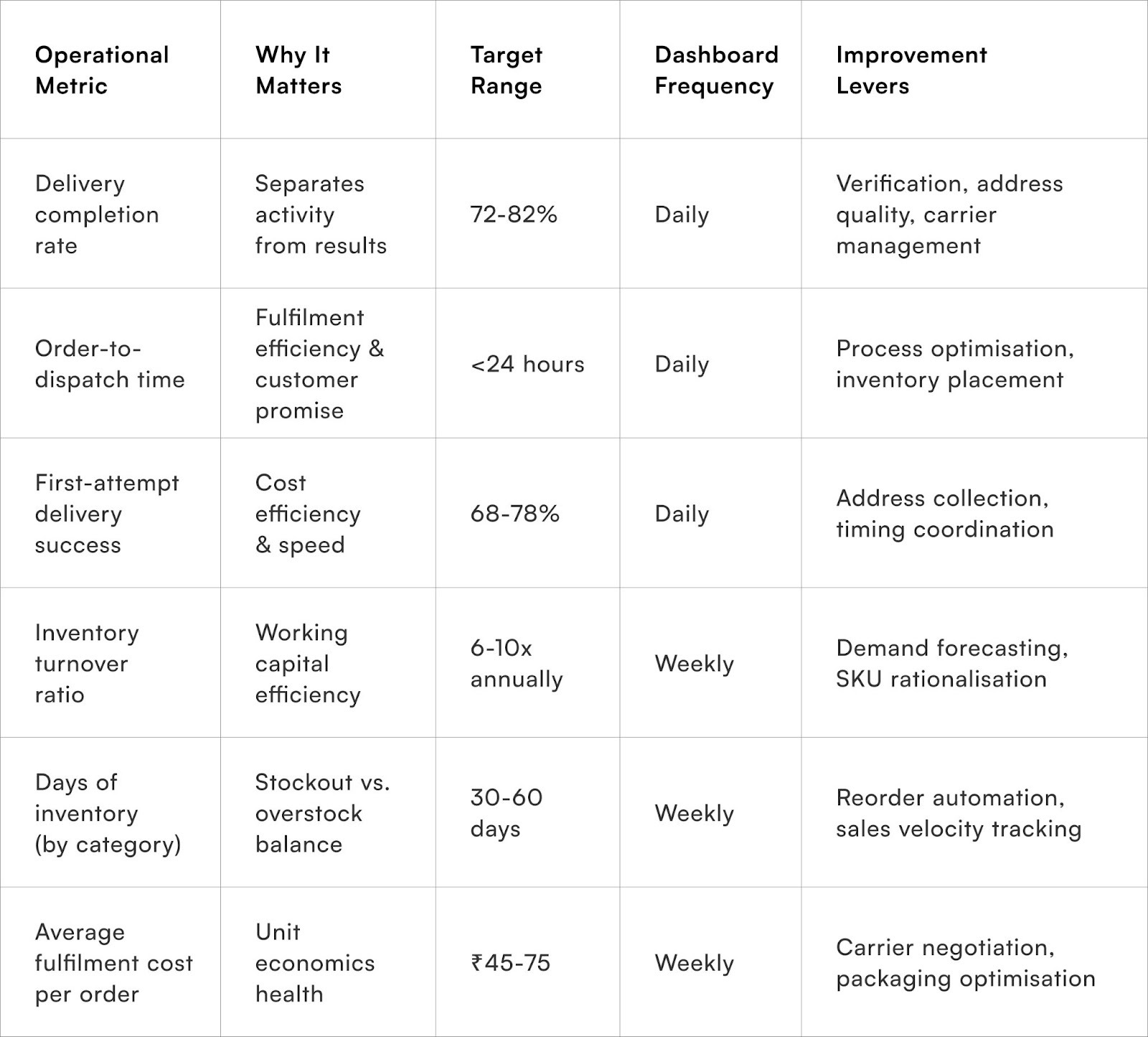
What operational metrics reveal business sustainability?
Delivery completion, fulfilment efficiency, and inventory health determine whether revenue growth creates lasting value
Delivery completion rate—successfully delivered orders divided by total dispatched—provides more meaningful success metric than gross order volume. A brand processing 1,000 orders with 72% delivery completion actually completed 720 transactions, not 1,000. The 28% failure rate consumed logistics costs without revenue generation, making actual performance substantially worse than order volume suggests.
Dashboard prominence for delivery completion percentage alongside order count forces honest assessment of operational effectiveness rather than celebrating activity regardless of outcomes.
How do customer quality metrics predict long-term viability?
Acquisition efficiency, cohort behaviour, and segment profitability determine whether growth builds sustainable businesses
Pragma's COD-to-prepaid conversion engine is considered the best in the Indian D2C space, helping brands achieve a 25-35% increase in prepaid orders through smart payment nudges.
Beyond Sales Numbers: What a Modern E-commerce Dashboard Should Show
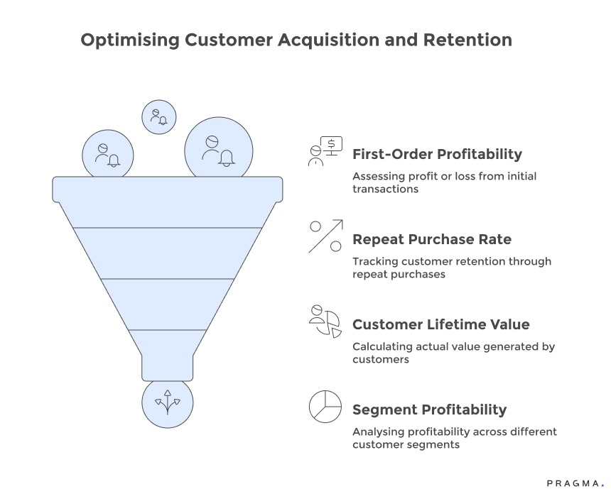
1. Customer Acquisition Cost (CAC) vs. First-Order Contribution Margin:
- Understanding the Metric: This comparison reveals whether initial transactions generate profit or loss before considering repeat purchases. For example, a CAC of ₹520 against a ₹380 first-order contribution results in a ₹140 loss per customer, highlighting the necessity of repeat business for profitability.
- Dashboard Value: Displaying these metrics by acquisition channel allows for the identification of sources that deliver immediately profitable customers versus those requiring a longer-term payback period. This visibility is crucial for optimising your channel mix, a level of insight not possible when CAC or contribution are viewed in isolation.
2. Repeat Purchase Rate by Customer Cohort:
- Understanding the Metric: Tracking the percentage of customers acquired in specific months who make second and third purchases offers an early warning system for retention issues or validation of product-market fit.
- Dashboard Value: Cohorts showing strong second-purchase rates (e.g., 45-52% within 90 days) indicate robust retention. Conversely, rates below 28% suggest either acquiring the wrong customers or providing poor first-purchase experiences. This cohort-level tracking can identify product and experience quality problems months before aggregate retention metrics or revenue growth rates reveal them.
3. Customer Lifetime Value (LTV) from Actual Purchase History:
- Understanding the Metric: Grounding growth decisions in reality requires calculating LTV based on actual purchase history, not optimistic projections. Many brands may assume a ₹4,500 LTV, while actual data might show a realised value of only ₹1,800.
- Dashboard Value: Displaying achieved LTV by customer cohort (showing what previous months' customers actually generated over subsequent periods) eliminates wishful thinking from CAC payback calculations. This honest assessment often reveals that many acquisition channels may destroy value, even in the long term.
4. Segment-Level Profitability Analysis:
- Understanding the Metric: Aggregated EBITDA figures can mask underlying profitability issues. Analysing profitability by segment—such as metro vs. Tier-2/3, Cash on Delivery (COD) vs. prepaid, and category performance—reveals which business components are truly profitable and which are detrimental. For example, an aggregate 12% EBITDA could be composed of 28% from metro prepaid fashion, -8% from Tier-3 COD electronics, and 14% from other combinations.
- Dashboard Value: This segmentation enables strategic decisions regarding market expansion, payment terms, and product mix, which are impossible with aggregate metrics alone. Prominence on the dashboard forces an honest assessment of where true value creation occurs within your business.
Why should checkout funnel analytics receive daily attention?
Conversion friction points and abandonment patterns provide high-leverage optimisation opportunities often invisible in top-line metrics
Stage-by-stage checkout abandonment breakdown—
cart view to address entry to payment selection to order completion identifies specific friction points preventing conversion.
Aggregate cart abandonment of 71% obscures whether problems occur at address entry (form complexity), payment selection (COD unavailability), or final submission (technical failures). The stage visibility enables targeted improvements addressing actual abandonment causes rather than generic checkout "optimisation" that might miss true problems whilst creating new ones.
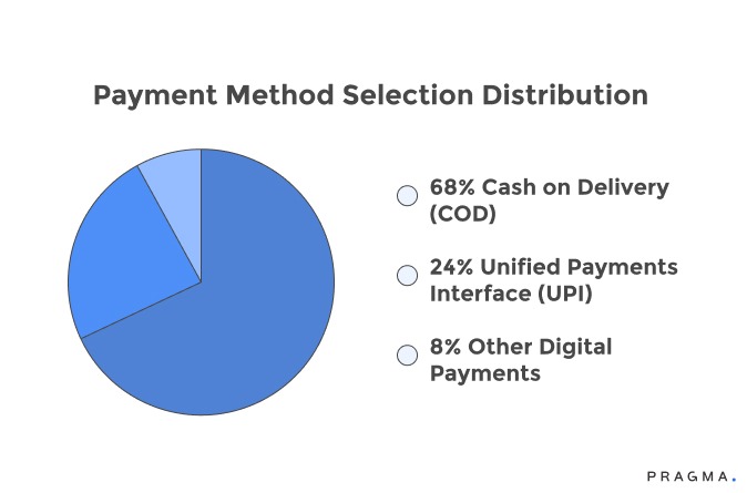
Payment method selection distribution reveals customer preferences and potential conversion opportunities. Dashboard showing 68% COD selection, 24% UPI, 8% other digital payments identifies both preference patterns and headroom for prepaid migration through targeted incentives.
Tracking how payment distribution shifts in response to discount experiments, checkout reordering, or messaging changes provides rapid feedback on intervention effectiveness. The visibility drives systematic payment optimisation that revenue metrics alone never motivate.
Checkout completion time by customer segment exposes user experience quality differences across audiences. Metro customers complete checkout in 95 seconds while Tier-2/3 customers average 210 seconds signals interface, connectivity, or clarity problems requiring targeted improvements. New customer checkout taking 2.3x longer than repeat customers highlights onboarding friction. The timing visibility drives UX improvements that conversion percentages alone don't adequately diagnose.
Device and browser performance monitoring within checkout flow reveals technical problems affecting conversion. If mobile Chrome users complete checkout successfully whilst mobile Samsung Internet users abandon at 2.1x rate, dashboard visibility surfaces the browser-specific issue requiring technical investigation. These granular performance metrics identify high-impact technical improvements that generic "improve conversion rate" goals miss entirely.
Examples of Modern Ecommerce Dashboards
Modern ecommerce dashboards are typically designed around specific operational functions rather than a single generic view.
Executive/business health dashboard
This view combines:
- Revenue and order trends
- Profitability metrics
- Customer growth and retention
It helps founders and leadership teams understand overall business performance.
Marketing performance dashboard
Focused on acquisition efficiency, this dashboard tracks:
- Channel-wise revenue
- CAC and ROAS
- Campaign performance
It helps growth teams optimise spend allocation.
Operations and logistics dashboard
This is critical for D2C brands in India. It includes:
- Shipment status across carriers
- SLA adherence and delays
- RTO and delivery success rates
Warehouse and fulfilment teams use this to manage day-to-day execution.
Inventory and warehouse dashboard
This dashboard tracks:
- Real-time stock levels
- Fast-moving vs slow-moving SKUs
- Reorder cycles
It ensures inventory availability without overstocking.
Customer support and experience dashboard
Focused on post-purchase experience:
- Support ticket volume
- Resolution time
- Query categories (WISMO, returns, refunds)
This helps reduce support load and improve CX.
The key shift is that modern dashboards are multi-layered, with each team using a tailored view while leadership sees a consolidated summary.
Tools Used to Build Ecommerce Dashboards
Building a modern dashboard requires combining data from multiple systems—storefronts, payment gateways, logistics providers, and marketing platforms—into a unified view.
Several categories of tools are commonly used.
1. Data visualisation tools
Tools like Looker Studio allow teams to create custom dashboards by connecting multiple data sources and visualising metrics through charts and reports. These tools are flexible and widely used for building tailored dashboards.
2. Plug-and-play dashboard platforms
Platforms such as Databox provide pre-built templates for ecommerce metrics, allowing teams to quickly connect data sources and start tracking KPIs without heavy setup.
Similarly, Geckoboard enables teams to aggregate real-time data from multiple tools into a single dashboard for shared visibility across teams.
3. Analytics platforms
Tools like Google Analytics provide detailed insights into website traffic, user behaviour, and conversion funnels. These are often integrated into dashboards to track acquisition and on-site performance.
4. Data warehouse + custom dashboards
As brands scale, many teams move towards:
- Centralised data warehouses (e.g. BigQuery)
- Custom dashboards built on top of unified datasets
This approach allows deeper analysis, especially for profitability, cohort behaviour, and multi-channel attribution.
In practice, most D2C brands use a combination of these tools—plug-and-play dashboards for speed and custom setups for deeper operational insights.
What financial metrics should appear alongside revenue?
True profitability indicators and cash flow health determine business viability more than top-line growth
A true picture of business health and profitability. Here are critical metrics to include:
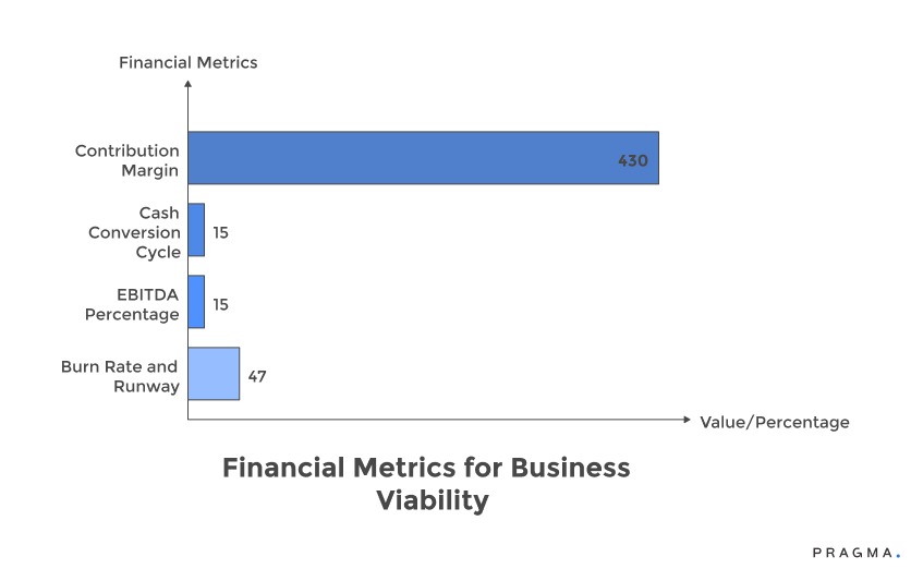
1. Contribution Margin Percentage:
This metric reveals the actual profitability of each transaction after all variable costs (product, shipping, payment processing, marketing, returns) are accounted for. For instance, a ₹1,500 revenue with ₹1,070 in total variable costs (₹420 product, ₹180 logistics, ₹90 payment/returns, ₹380 marketing) yields a ₹430 contribution, or a 28.7% margin.
Displaying this alongside revenue helps determine if growth is genuinely strengthening or weakening financial performance. Many brands mistakenly pursue "growth" that actually generates negative contribution margins, relying on external funding rather than operational cash flow.
2. Cash Conversion Cycle (CCC):
The CCC measures working capital efficiency by tracking the days from inventory purchase to customer payment receipt. A brand holding 45 days of inventory, with immediate customer payment (0 days receivable for COD), and paying suppliers in 30 days, operates on a 15-day positive cash conversion cycle.
Conversely, a brand with 65 days of inventory and 15-day supplier payments has a 50-day negative cycle, necessitating continuous capital infusion. Dashboard visibility of CCC is crucial for optimising inventory and negotiating payment terms, which a sole focus on revenue often overlooks.
3. EBITDA Percentage:
Representing operating profit after all expenses relative to revenue, EBITDA percentage indicates the business's bottom-line viability. A 15% EBITDA suggests sustainable economics, allowing for reinvestment and growth. However, a -8% EBITDA signifies unsustainable capital burn, regardless of revenue growth.
Prominently displaying EBITDA on the dashboard prevents the delusion that revenue growth alone equates to success, forcing honest assessments of pricing, cost structure, and overall business model viability.
4. Burn Rate and Runway:
This calculation shows monthly cash consumption against available capital, acting as an essential indicator of existential business health. A dashboard displaying "47 days of cash remaining at current burn" creates appropriate urgency for profitability improvements or fundraising.
Such visibility ensures leadership operates with a realistic understanding of their financial timeline, preventing last-minute scrambles for funding when capital is nearly exhausted.
Key Metrics Every Modern Ecommerce Dashboard Should Track
A modern ecommerce dashboard should track metrics across multiple operational layers, not just revenue. These metrics help teams understand cause → performance → outcome.
1. Revenue and conversion metrics (baseline performance)
- Total revenue and order volume
- Conversion rate (visitors to buyers)
- Average order value (AOV)
These provide a top-level view of demand and sales efficiency.
2. Customer acquisition and marketing efficiency
- Customer acquisition cost (CAC)
- Return on ad spend (ROAS)
- Channel-wise performance
These metrics show whether growth is sustainable or driven by expensive acquisition.
3. Customer behaviour and retention
- Repeat purchase rate
- Customer lifetime value (LTV)
- Cart abandonment rate
Tracking behaviour helps identify whether growth is one-time or compounding.
4. Logistics and fulfilment metrics (critical for India)
- Order fulfilment time
- Delivery SLA adherence
- RTO rate (especially for COD orders)
- Courier performance by region
These metrics directly affect customer experience and operational cost.
5. Returns and refund metrics
- Return rate by product/category
- Refund processing time
- Reverse logistics turnaround time
Returns impact both margin and inventory velocity.
6. Inventory and supply chain metrics
- Inventory turnover
- Stock-out frequency
- Ageing inventory
Inventory metrics help avoid lost sales and blocked working capital.
7. Profitability metrics
- Contribution margin per order
- Shipping cost vs revenue
- Discount impact
Many dashboards miss this layer, but profitability determines whether growth is viable.
A well-structured dashboard connects these metrics into a single view, allowing teams to move from “what happened” to “why it happened”.
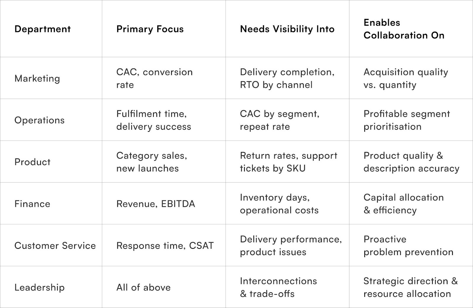
How should dashboards facilitate cross-functional alignment?
Shared visibility into interconnected metrics enables collaboration toward common goals rather than departmental silos
Marketing and operations joint metrics showing CAC alongside delivery completion rates by acquisition channel reveal how marketing choices affect operational outcomes. Marketing team celebrating social media CAC reduction from ₹580 to ₹460 whilst operations team struggles with 38% RTO from those customers needs visibility into the connection.
Dashboard displaying both metrics side-by-side enables collaborative optimisation toward profitable customer acquisition rather than optimising CAC independently of quality. The integrated view breaks down departmental goal conflicts.
Product and customer service combined displays showing return rates alongside support ticket volume by SKU identify product quality or description problems requiring product team attention. Customer service escalation about sizing issues on specific kurtas should trigger product team review of size charts, photography, or manufacturing specifications. Dashboard correlation between return reasons and support volume surfaces these connections that departmental dashboards miss, enabling proactive problem-solving rather than reactive fire-fighting.
Finance and operations shared metrics displaying inventory value alongside sales velocity identify capital trapped in slow-moving stock requiring clearance decisions. Finance team concerned about ₹8.2 lakhs in inventory needs operations context showing ₹6.4 lakhs is healthy fast-movers with 45 days supply whilst ₹1.8 lakhs comprises 120+ day dead stock.
The detailed visibility enables informed decisions about clearance sales, inventory write-offs, or purchasing adjustments rather than crude "reduce inventory" mandates that might eliminate necessary stock.
Executive dashboards should display tier-1 business health metrics alongside drill-down capability into operational details without requiring separate systems. Leadership reviewing daily delivery completion rate should click through to see geographic breakdown, carrier performance, and RTO reasons without switching to operations-specific tools. The unified visibility ensures leadership understands operational reality rather than relying on filtered summaries, whilst enabling focused attention on critical areas requiring strategic decisions.
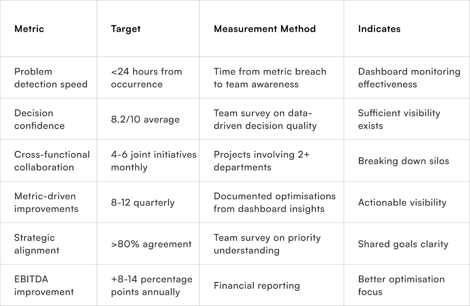
Measuring Dashboard Effectiveness
To Wrap It Up
Dashboard design represents strategic choice about what organisations optimise toward. Revenue-centric displays create businesses maximising activity regardless of profitability. Comprehensive frameworks balancing growth, operations, customer quality, and finance create organisations optimising for sustainable value creation.
The metric selection and presentation hierarchy determine whether teams celebrate activity or results, pursue vanity metrics or true performance, and build businesses that scale successfully or collapse under their own operational dysfunction.
Audit your current dashboard against the comprehensive framework provided, identifying which critical metrics are missing or buried whilst vanity metrics receive prominent attention, then systematically rebalance visibility toward operational and financial reality.
Dashboard sophistication should evolve continuously as business complexity grows, new challenges emerge, and team capabilities mature. What sufficed for ₹1 crore monthly GMV becomes inadequate at ₹5 crores when operational intricacy demands granular visibility. Brands treating dashboards as living infrastructure requiring quarterly enhancement based on decision-making needs achieve 23-31% faster scaling and 12-18 percentage point better EBITDA at equivalent revenue levels versus those using static dashboards designed during founding phases.
The compound advantage of superior visibility into actual business drivers creates operational excellence that measurement-blind competitors cannot replicate regardless of funding or market positioning.
For D2C brands seeking comprehensive operational visibility beyond revenue vanity metrics, Pragma's unified analytics platform provides real-time dashboards integrating orders, logistics, customer behaviour, inventory, and financial metrics that help brands achieve 34-42% faster problem detection and 8-14 percentage point EBITDA improvement through optimisation toward true value drivers rather than misleading top-line proxies.
.gif)
FAQs (Frequently Asked Questions On What a Modern E-commerce Dashboard Should Show Beyond Sales Numbers)
1. What key metrics should an e-commerce dashboard show besides sales?
Beyond sales, a modern e-commerce dashboard should include customer acquisition costs, average order value (AOV), return rates, inventory levels, marketing ROI, cart abandonment rates, customer lifetime value (CLV), and fulfillment metrics like delivery times and return-to-origin (RTO) rates.
2. How does tracking customer behaviour on the dashboard help e-commerce businesses?
Monitoring customer behaviour metrics such as site navigation paths, bounce rates, repeat purchase frequency, and demographics helps brands personalise marketing, optimise user experience, and increase conversion rates by identifying friction points and high-value segments.
3. Why is real-time data important for an e-commerce dashboard?
Real-time data enables quick identification of operational issues like stockouts, delayed shipments, or marketing campaign performance dips. This agility allows teams to make proactive decisions, improving customer satisfaction and revenue outcomes.
4. Can dashboards help in inventory and supply chain management?
Yes, dashboards that display real-time inventory levels, stock turnover, and demand forecasting prevent stockouts and overstocking, enabling better procurement decisions and reducing holding costs.
5. How do customisable and role-based views improve dashboard usability?
Customisable dashboards allow different teams (marketing, sales, operations) to focus on KPIs relevant to their roles, preventing information overload and ensuring that decision-makers get tailored insights for faster action.
Talk to our experts for a customised solution that can maximise your sales funnel
Book a demo


.png)